

Ebay is a leading global e-commerce platform that serves a diverse user base, from casual shoppers to proffessional sellers.
In this case study, I embarked on redesigning the eBay home page and product page for both the website and mobile app. The goal was to improve user experience, streamline the buying process, and create a more visually appealing interface that aligns with modern e-commerce trends.
UI/UX Design, User Research, Prototyping
3 Months
Figma, Miro, Adobe XD, Balsmiq, Photoshop, Slack
Users experienced information overload, inconsistent navigation, and challenges in finding relevant products, resulting in an overwhelming experience on both the website and mobile app.
A redesign of eBay's home and product pages focusing on decluttering the interface, enhancing the visual hierarchy, and introducing a more intuitive navigation system. The redesign gives a responsive design that maintains consistency across devices.
Baymard Institute indicates that 69.57% of users abandon their shopping carts, primarily due to a complicated checkout process and unexpected costs. Through user interviews, many users expressed frustration with eBay's complex navigation and cluttered product listings. Studies also show users often experience cognitive overload due to the vast amount of information presented on e-commerce platforms. Simplifying the eBay checkout experience could significantly enhance user experiences.
Competitors utilize clean layouts with ample white space, vibrant product images, and clear calls to action.
For example, Amazon has set a high standard for e-commerce experiences: user-centric design, personalized recommendations, and easy one-click purchasing. With new platforms capitalizing on social ecommerce, this has raised expectations for eBay to innovate and enhance its platform to attract a younger demographic.
Home Page
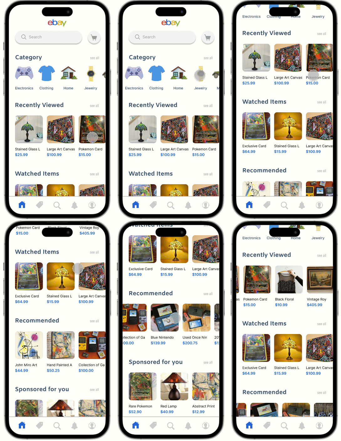
Home Page
Product Page 1
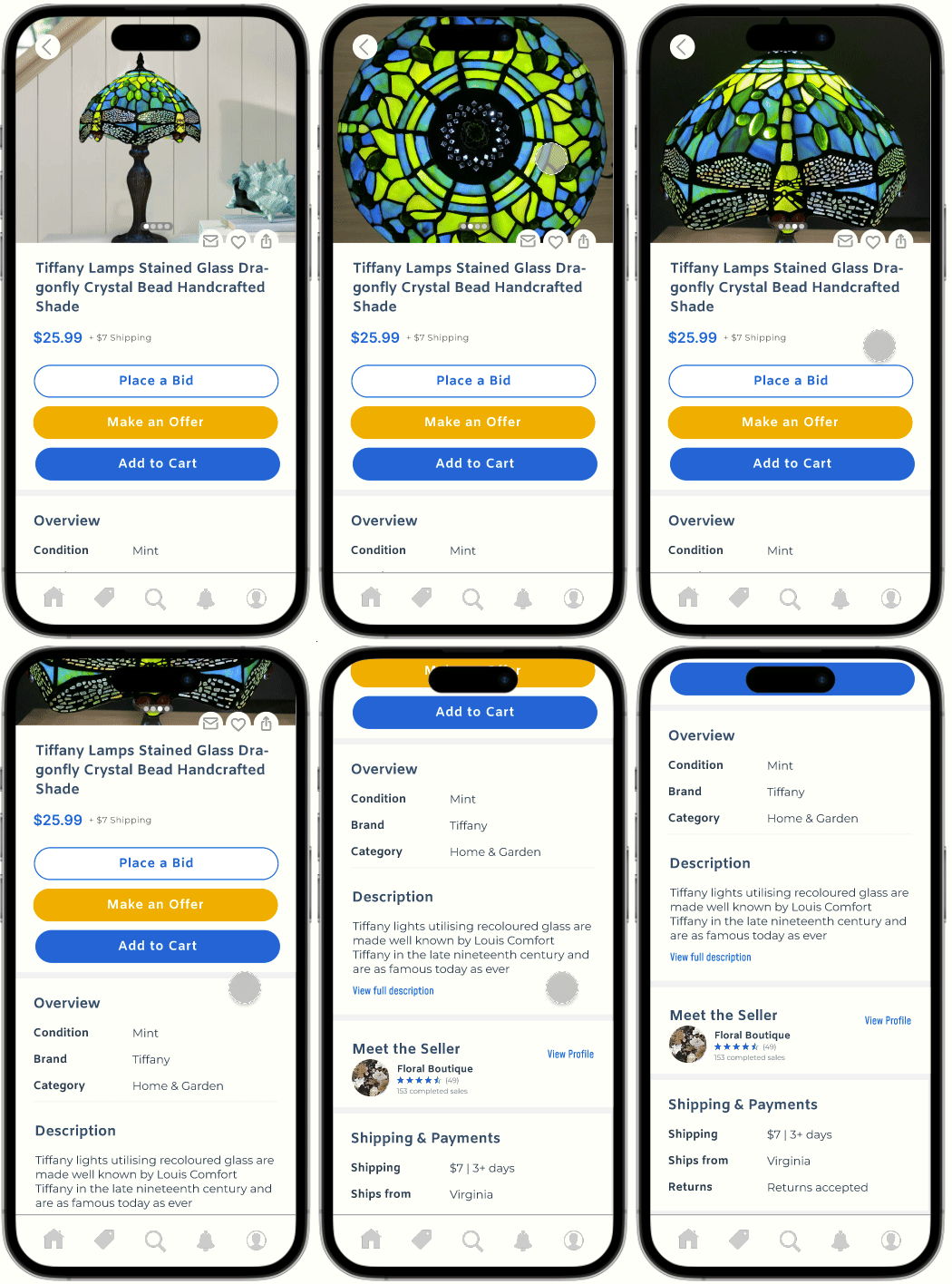
Product Page 1
Product Page 2
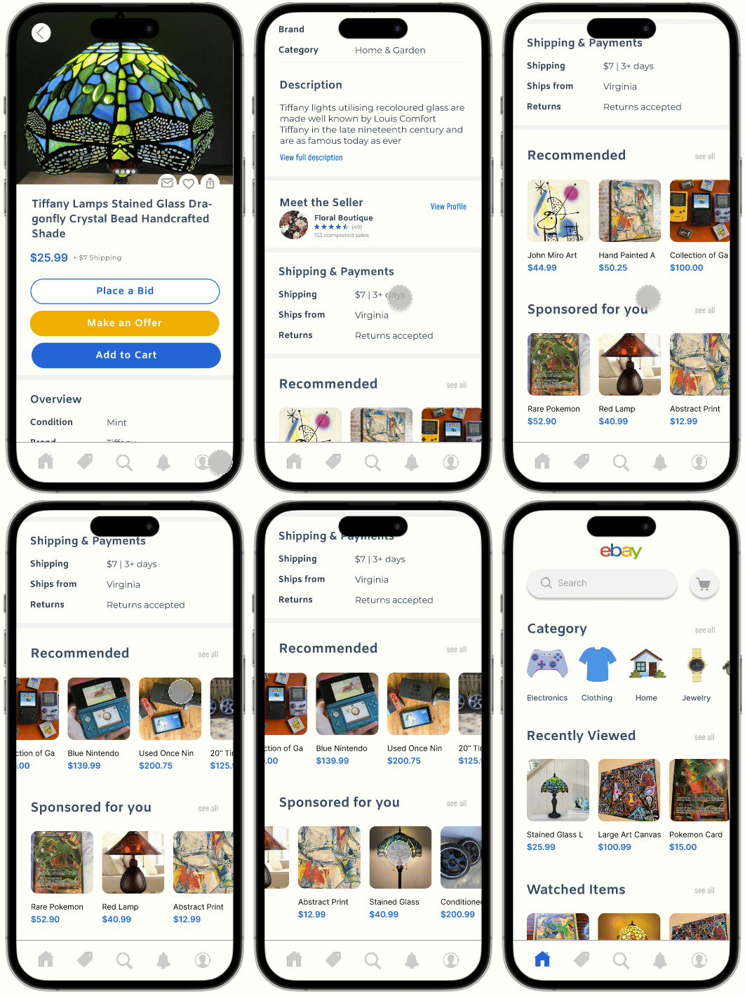
Product Page 2
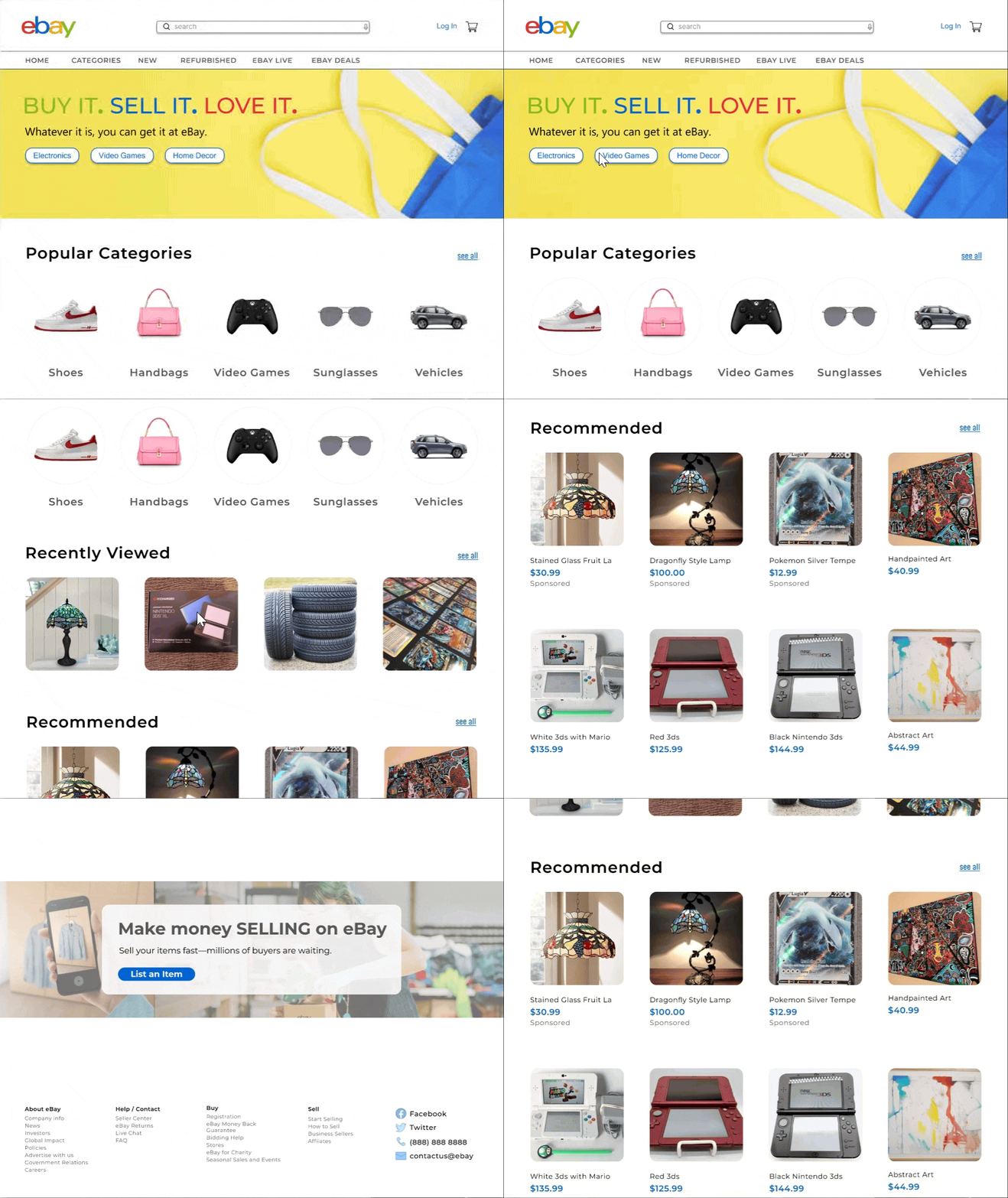
The streamlined layout allows users to effortlessly browse and discover products from around the world.
By minimizing visual clutter and improving navigation, the new layout ensures that users can quickly access categories, search for specific items, and discover personalized recommendations.
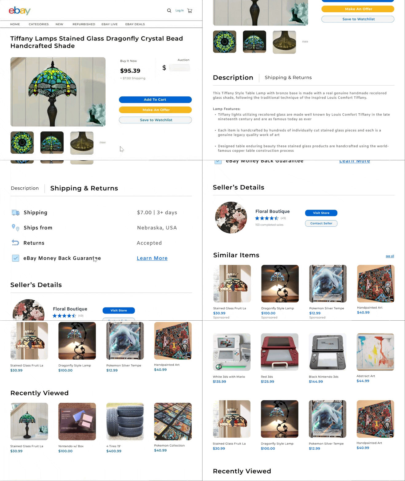
The product page was restructured to highlight key information more effectively, including clearer CTAs for 'Buy Now,' 'Make an Offer,' and 'Add to Cart' options
Users can now seamlessly explore various products, compare features, and make informed purchasing decisions with minimal effort and all while enjoying a clean and intuitive browsing experience..
Users can engage with sellers, place bids, or directly add items to their cart with enhanced clarity and ease, making the buying process smoother and more transparent.
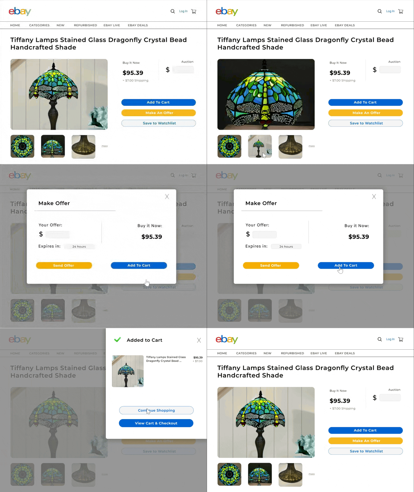
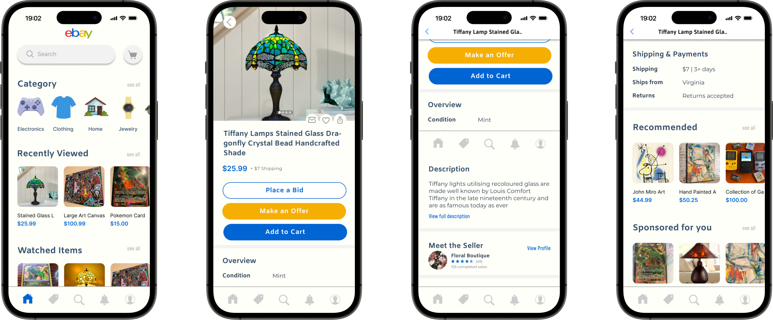
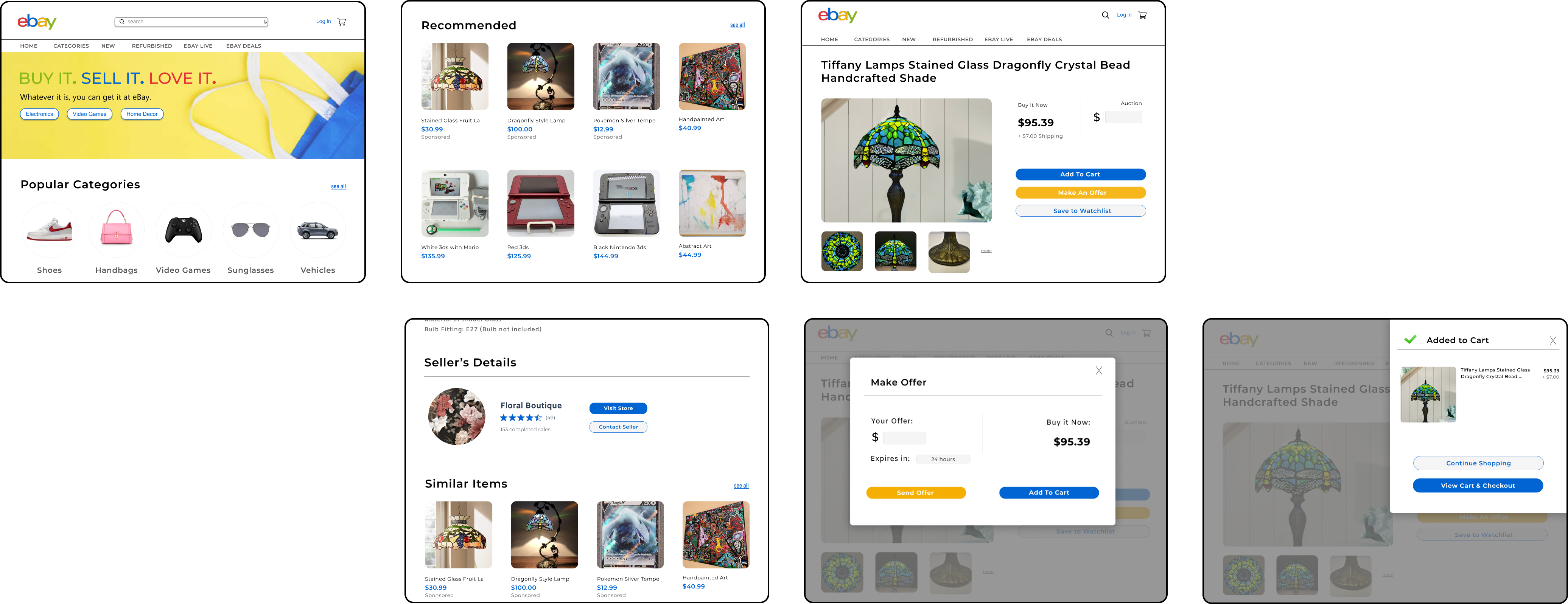
I got a lot of peer review through my classmates and professor. Throughout the semester, I did a lot of sketches and reiterations, and I was overall proud of my final submission.
I would continue with my redesigns into ebay's other important pages.